
Windows may get all the press coverage, but when you want to get real work done, you turn your attention to the applications that run on it. And if you use spreadsheets, that generally means Excel.
Excel is, of course, part of Microsoft’s Office suite of productivity tools. Microsoft sells Office under two models: Individuals and businesses can pay for the software license up front and own it forever (what the company calls the “perpetual” version of the suite), or they can purchase a Microsoft 365 or Office 365 subscription, which means they have access to the software for only as long as they keep paying the subscription fee.
When you purchase a perpetual version of the suite — say, Office 2019 or Office 2021 — its applications will never get new features, whereas Microsoft 365 apps are continually updated with new features. For more details, see “Office 2021 vs. Microsoft 365: How to choose.”
This cheat sheet gets you up to speed on the features that have been introduced in Microsoft 365’s Excel for Windows desktop client since 2015. We’ll periodically update this story as new features roll out. (If you’re using the perpetual-license Excel 2016 or 2019, see our seperate Excel 2016 and 2019 cheat sheet. If you have Office 2021, check out “What’s new in Office 2021.”)
Use the Ribbon
The Ribbon interface that you came to know and love (or perhaps hate) in earlier versions of Excel is still alive and well. Since the Ribbon has been included in Office applications since Office 2007, we assume that by now you’re familiar with how it works. If you need a refresher, see our Excel 2010 cheat sheet.
In 2018, Microsoft overhauled the way the Ribbon looks, and the company has continued to tinker with the design since then. It’s now flatter-looking, cleaner, and less cluttered, and it has high-contrast colors, which makes the icons and text on the Ribbon easier to see. Some time after Microsoft released Windows 11, the company again gave the Ribbon (and Office overall) a slight facelift, so it more closely aligns with that new version of Windows. But it still works in the same way, and you’ll find most of the commands in the same locations as in earlier versions.
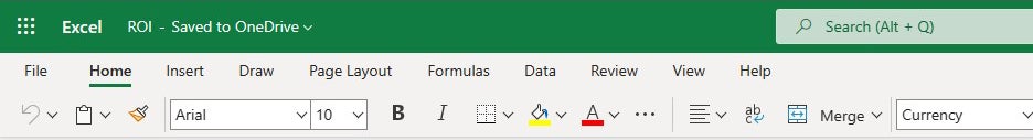
 IDG
IDGThrough the years, Excel’s Ribbon has gotten a variety of cosmetic changes, but it still works largely the way it always has. (Click image to enlarge it.)
The new look appears in both Windows 10 and Windows 11, but depending on your installation, it may or may not show up by default. You can check by clicking the icon of a megaphone near the top right of the screen above the Ribbon. In the Coming Soon screen that appears, look at the “Try the new experience” slider. If it’s “On,” it likely means you’re using the new interface. If it’s “Off” and you’d like to turn it on, move the slider to “On” and restart Excel. That should turn on the new look.
One minor change to the Ribbon layout is that there’s now a Help tab to the right of the View tab. To find out which commands reside on which tabs on the Ribbon, download our Excel for Microsoft 365 Ribbon guide. Also note that you can use the search bar on the Ribbon to find commands.
Find popular commands on the Ribbon in Microsoft Excel for Microsoft 365/Office 365 in Windows. Computerworld
Just as in previous versions of Excel, if you want the Ribbon commands to go away, press Ctrl-F1. (Note that the tabs above the Ribbon — File, Home, Insert, and so on — stay visible.) To make them reappear, press Ctrl-F1 again.
You’ve got other options for displaying the Ribbon as well. To get to them, click the Ribbon display options icon (a down arrow) on the bottom of the Ribbon at the far right, just below the Share button. A drop-down menu appears with these four options:
- Full-screen mode: This makes Excel take up your entire screen and hides the Ribbon. To get out of full-screen mode, click the three-dot icon at the upper right of the screen.
- Show tabs only: This shows the tabs but hides the commands underneath them. It’s the same as pressing Ctrl-F1. To display the commands underneath the tabs when they’re hidden, press Ctrl-F1, click a tab, or click the Ribbon display options down arrow and select Always show Ribbon.
- Always show Ribbon: This displays the entire Ribbon, both the tabs and commands underneath them.
- Show Quick Access toolbar: This displays the Quick Access toolbar, which gives you fast access to Excel commands you want to have available no matter which tab you’re on. When you enable the toolbar, it starts off empty. To populate it, click a small down arrow that appears at the right of the toolbar and from the drop-down menu that appears, choose which features to put on it. If you don’t see a command you want, click More Commands. Find the command you want on the left and click Add. To make the Quick Access toolbar go away, click the Ribbon display options down arrow and select Hide Quick Access toolbar.
To customize the title bar above the Ribbon, select File > Options, and from the screen that appears, select General. In the “Personalize your copy of Microsoft Office” section, click the down arrow next to Office Theme and select Dark Gray, Black, or White from the drop-down menu. To make the title bar green again, instead choose the Colorful option from the drop-down list.
There’s a useful feature in what Microsoft calls the backstage area that appears when you click the File tab on the Ribbon. If you click Open or Save a Copy from the menu on the left, you can see the cloud-based services you’ve connected to your Office account, such as SharePoint and OneDrive. Each location displays its associated email address underneath it. This is quite helpful if you use a cloud service with more than one account, such as if you have one OneDrive account for personal use and another one for business. You’ll be able to see at a glance which is which.
 IDG
IDGThe backstage area shows which cloud-based services you’ve connected to your Microsoft 365 account.
Possibly in the works: a simplified Ribbon
Way back in 2018, Microsoft announced that it was working on a simplified version of the Ribbon for all Office applications. Like the existing Ribbon, it would have tabs across the top, and each tab would have commands on it. But it would be more streamlined and use less space than the existing Ribbon.
Nearly 5 years later, Outlook for Windows is the only Microsoft 365 desktop app that offers the simplified Ribbon. At this point we’re somewhat skeptical that it will ever appear in the Excel desktop app. However, it has rolled out to the web version of Excel. With an Excel workbook open in your browser, click the Switch Ribbons icon (a tiny up arrow) at the far right of the Ribbon to see the simplified Ribbon. To change it back, click the Switch Ribbons icon (now a tiny down arrow) again.
 IDG
IDGHere’s the simplified Ribbon in Excel for the web. (Click image to enlarge it.)
In the simplified Ribbon, all the commands are still there for each tab, but only the most commonly used ones are visible. Click the three-dot icon at the far right to show the rest of the commands in a drop-down menu.
This is likely how the simplified Ribbon will work in Excel for Windows — if it ever arrives in the desktop app.
Search to get tasks done quickly
Excel has never been the most user-friendly of applications, and it has so many powerful features it can be tough to keep track of them all. In Excel 2016, Microsoft made it easier with an enhanced search feature called Tell Me, which put even buried tools in easy reach. Now Microsoft has renamed the feature Search, but it works the same way.
To use it, click in the Search box — it’s above the Ribbon in the green title area. (Keyboard fans can instead press Alt-Q.) Then type in a task you want to do, such as create a PivotTable. You’ll get a menu showing potential matches for the task. In this instance, the top result is a direct link to the form for creating a PivotTable — select it and you’ll start creating the PivotTable right away, without having to go to the Ribbon’s Insert tab first.
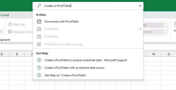 IDG
IDGThe search box makes it easy to perform just about any task in Excel. (Click image to enlarge it.)
If you’d like more information about your task, the final items that appear in the menu let you select from related Help topics.
Even if you consider yourself a spreadsheet jockey, it’s worth your while to try out the enhanced search function. It’s a big time-saver, and far more efficient than hunting through the Ribbon to find a command. Also useful is that it remembers the features you’ve previously clicked on in the box, so when you click in it, you first see a list of previous tasks you’ve searched for. That makes sure that tasks that you frequently perform are always within easy reach. And it puts tasks you rarely do within easy reach as well.
One last note: The search box isn’t limited to searching for tasks. You can also use it to look up word definitions using Bing, and users with Microsoft 365/Office 365 business accounts can use it to search for company contacts or for files stored in OneDrive or SharePoint.
You can also now use the search box to do a general internet search using the new Bing search capabilities, although I’ve found this feature to be not fully baked yet. For example, when I did a search on “What is France’s GDP,” it gave me the answer, but when I asked “What is GDP” it gave no answer. So it’s worth trying out, but not relying on.
 IDG
IDGYou can do a general internet search from Excel’s search box, but it doesn’t always give you an answer.
Note, too, that you’ll get different answers using the search box than you do using the Smart Lookup feature, described below.
Use Smart Lookup for online research
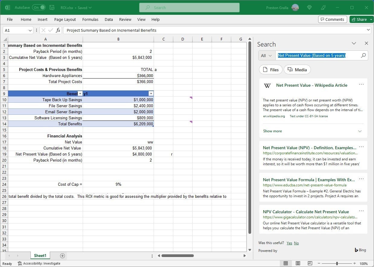
Another feature, Smart Lookup, lets you do research while you’re working on a spreadsheet. Right-click a cell with a word or group of words in it, and from the menu that appears, select Smart Lookup.
When you do that, Excel uses Microsoft’s Bing search engine to do a web search on the word or words, then displays definitions, any related Wikipedia entries, and other results from the web in the Search pane that appears on the right. Click any result link to open the full page in a browser. If you want to browse files on your computer related to the word or words, click the Files button, and if you want to search for related media (photos, graphics, videos, etc.) click the Media button.
 IDG
IDGSmart Lookup is handy for finding general information, such as definitions of financial terms. (Click image to enlarge it.)
Smart Lookup does a good job finding specific information, such as the inflation rate in France in 2020, steel output in the US, or more generic information such as financial terms. You can look up anything, not just terms related to finances or numbers. So if you need to find out Charles Dickens’ birthday, it’ll find that as well.
Note that in order to use Smart Lookup in Excel or any other Office app, you might first need to enable Microsoft’s intelligent services feature, which collects your search terms and some content from your spreadsheets and other documents. (If you’re concerned about privacy, you’ll need to weigh whether the privacy hit is worth the convenience of doing research from right within the app.) If you haven’t enabled it, you’ll see a screen when you click Smart Lookup asking you to turn it on. Once you do so, it will be turned on across all your Office applications.
Explore Excel’s advanced chart types
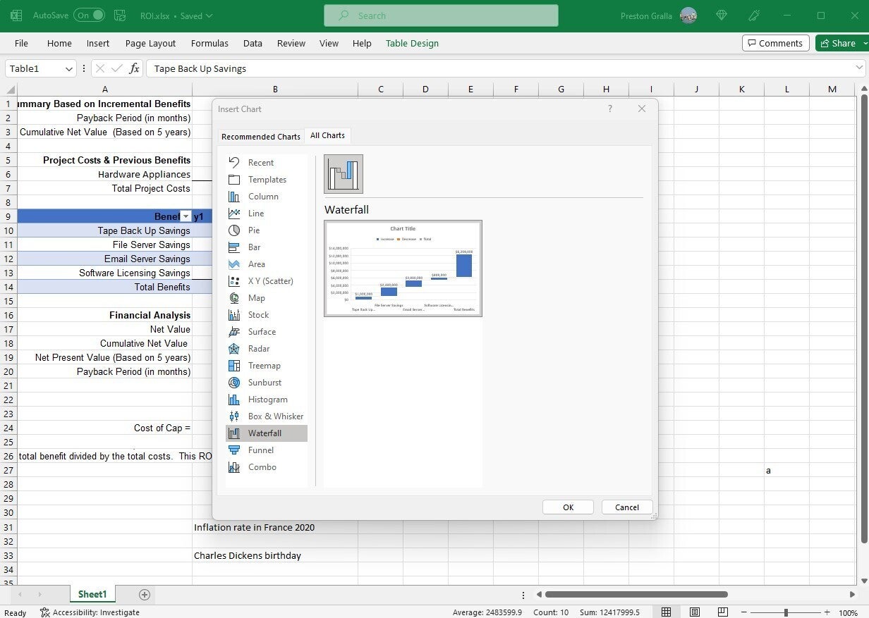
Spreadsheets aren’t just about raw data — they’re about charts as well. Charts are great for visualizing and presenting data, and for gaining insights from it. To that end, Microsoft has introduced a number of advanced chart types over the past several years, including most notably a histogram (frequently used in statistics), a “waterfall” that’s effective at showing running financial totals, and a hierarchical treemap that helps you find patterns in data. Note that the new charts are available only if you’re working in an .xlsx document. If you use the older .xls format, you won’t find them.
To see all the charts, put your cursor in a cell or group of cells that contains data, select Insert > Recommended Charts and click the All Charts tab. You’ll find the newer charts, mixed in with the older ones. Select any to create the chart.
 IDG
IDGExcel includes several new chart types, including waterfall. (Click image to enlarge it.)
These are the new chart types:
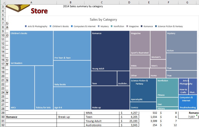
Treemap. This chart type creates a hierarchical view of your data, with top-level categories (or tree branches) shown as rectangles, and with subcategories (or sub-branches) shown as smaller rectangles grouped inside the larger ones. Thus, you can easily compare the sizes of top-level categories and subcategories in a single view. For instance, a bookstore can see at a glance that it brings in more revenue from 1st Readers, a subcategory of Children’s Books, than for the entire Non-fiction top-level category.
 IDG
IDGA treemap chart lets you easily compare top-level categories and subcategories in a single view. (Click image to enlarge it.)
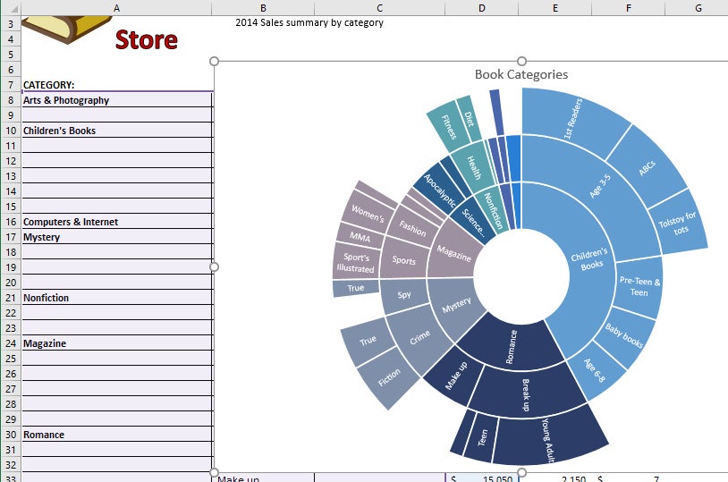
Sunburst. This chart type also displays hierarchical data, but in a multi-level pie chart. Each level of the hierarchy is represented by a circle. The innermost circle contains the top-level categories, the next circle out shows subcategories, the circle after that subsubcategories and so on.
Sunbursts are best for showing the relationships among categories and subcategories, while treemaps are better at showing the relative sizes of categories and subcategories.
 IDG
IDGA sunburst chart shows hierarchical data such as book categories and subcategories as a multi-level pie chart. (Click image to enlarge it.)
Waterfall. This chart type is well-suited for visualizing financial statements. It displays a running total of the positive and negative contributions toward a final net value.
 IDG
IDGA waterfall chart shows a running total of positive and negative contributions, such as revenue and expenses, toward a final net value. (Click image to enlarge it.)
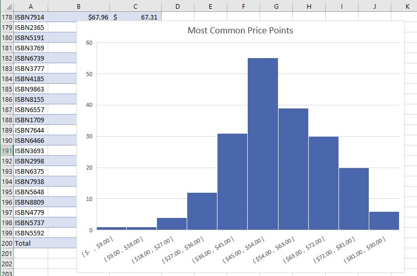
Histogram. This kind of chart shows frequencies within a data set. It could, for example, show the number of books sold in specific price ranges in a bookstore.
 IDG
IDGHistograms are good for showing frequencies, such as number of books sold at various price points. (Click image to enlarge it.)
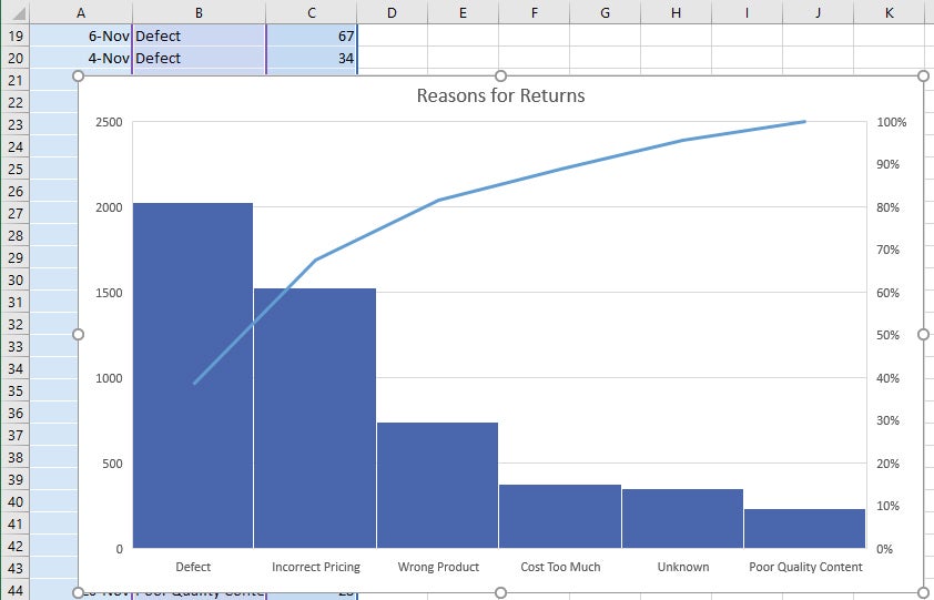
Pareto. This chart, also known as a sorted histogram, contains bars as well as a line graph. Values are represented in descending order by bars. The cumulative total percentage of each bar is represented by a rising line. In the bookstore example, each bar could show a reason for a book being returned (defective, priced incorrectly, and so on). The chart would show, at a glance, the primary reasons for returns, so a bookstore owner could focus on those issues.
Note that the Pareto chart does not show up when you select Insert > Recommended Charts > All Charts. To use it, first select the data you want to chart, then select Insert > Insert Statistic Chart, and under Histogram, choose Pareto.
 IDG
IDGIn a Pareto chart, or sorted histogram, a rising line represents the cumulative total percentage of the items being measured. In this example, it’s easy to see that more than 80% of a bookstore’s returns are attributable to three problems. (Click image to enlarge it.)
Box & Whisker. This chart, like a histogram, shows frequencies within a data set but provides for a deeper analysis than a histogram. For example, in a bookstore it could show the distribution of prices of different genres of books. In the example shown here, each “box” represents the first to third quartile of prices for books in that genre, while the “whiskers” (the lines extending up and down from the box) show the upper and lower range of prices. Outliers that are priced outside the whiskers are shown as dots, the median price for each genre is shown with a horizontal line across the box, and the mean price is shown with an x.
 IDG
IDGBox & Whisker charts can show details about data ranges such as the first to third quartile in the “boxes,” median and mean inside the boxes, upper and lower range with the “whiskers,” and outliers with dots. (Click image to enlarge it.)
Funnel. This chart type is useful when you want to display values at multiple stages in a process. A funnel chart can show the number of sales prospects at every stage of a sales process, for example, with prospects at the top for the first stage, qualified prospects underneath it for the second stage, and so on, until you get to the final stage, closed sales. Generally, the values in funnel charts decrease with each stage, so the bars in the chart look like a funnel.
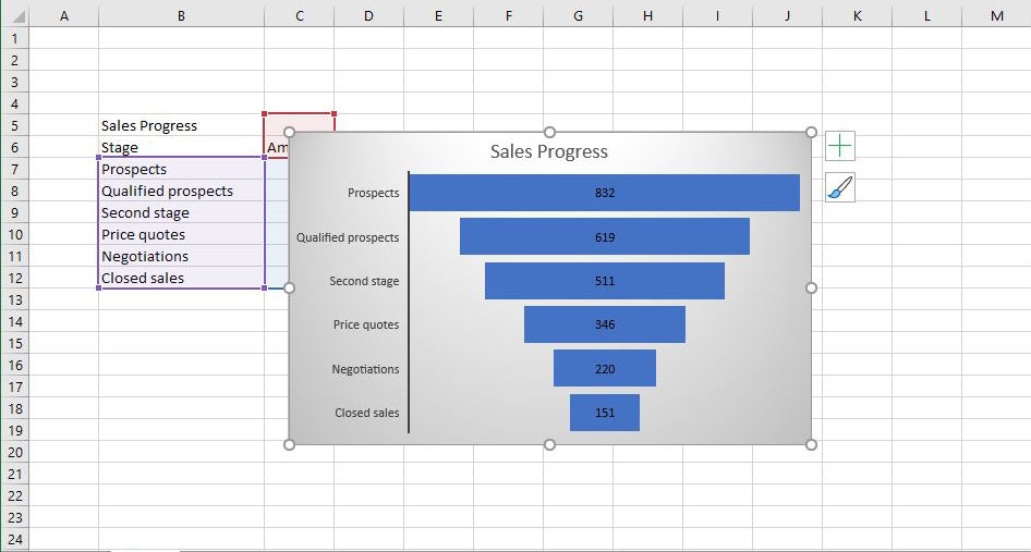 IDG
IDGFunnel charts let you display values at multiple stages in a process. (Click image to enlarge it.)
When creating the data for a funnel chart, use one column for the stages in the process you’re charting, and a second column for the values for each stage. Once you’ve done that, to create the chart, select the data, then select Insert > Recommended Charts > All Charts > Funnel.
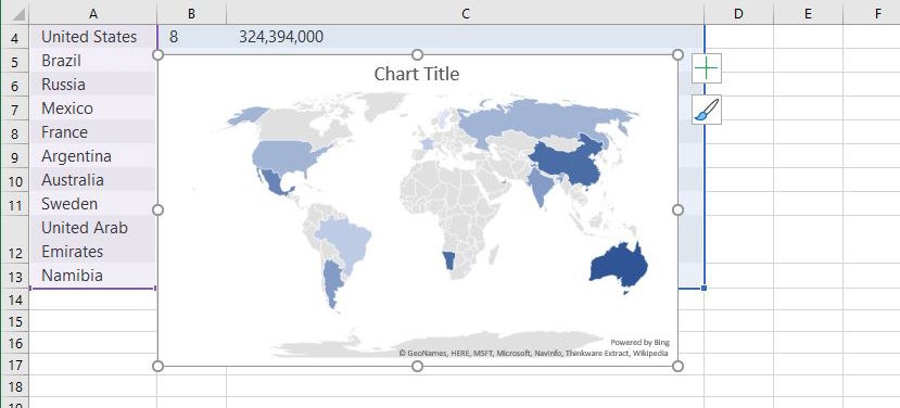
Map. Map charts do exactly what you think they should: They let you compare data across different geographical regions, such as countries, regions, states, counties, or postal codes. Excel will automatically recognize the regions and create a map that visualizes the data.
 iDG
iDGYou can compare data across different locations with a map chart. (Click image to enlarge it.)
To create a map chart, select the data you want to chart, then select Insert > Maps, then select the map chart. Note that in some instances, Excel might have a problem creating the map — for example, if there are multiple locations with the same name as one that you’re mapping. If that occurs, you’ll have to add one or more columns with details about the locations. If, say, you’re charting towns in the United Kingdom, you would have to include columns for the county and country each town is located in.